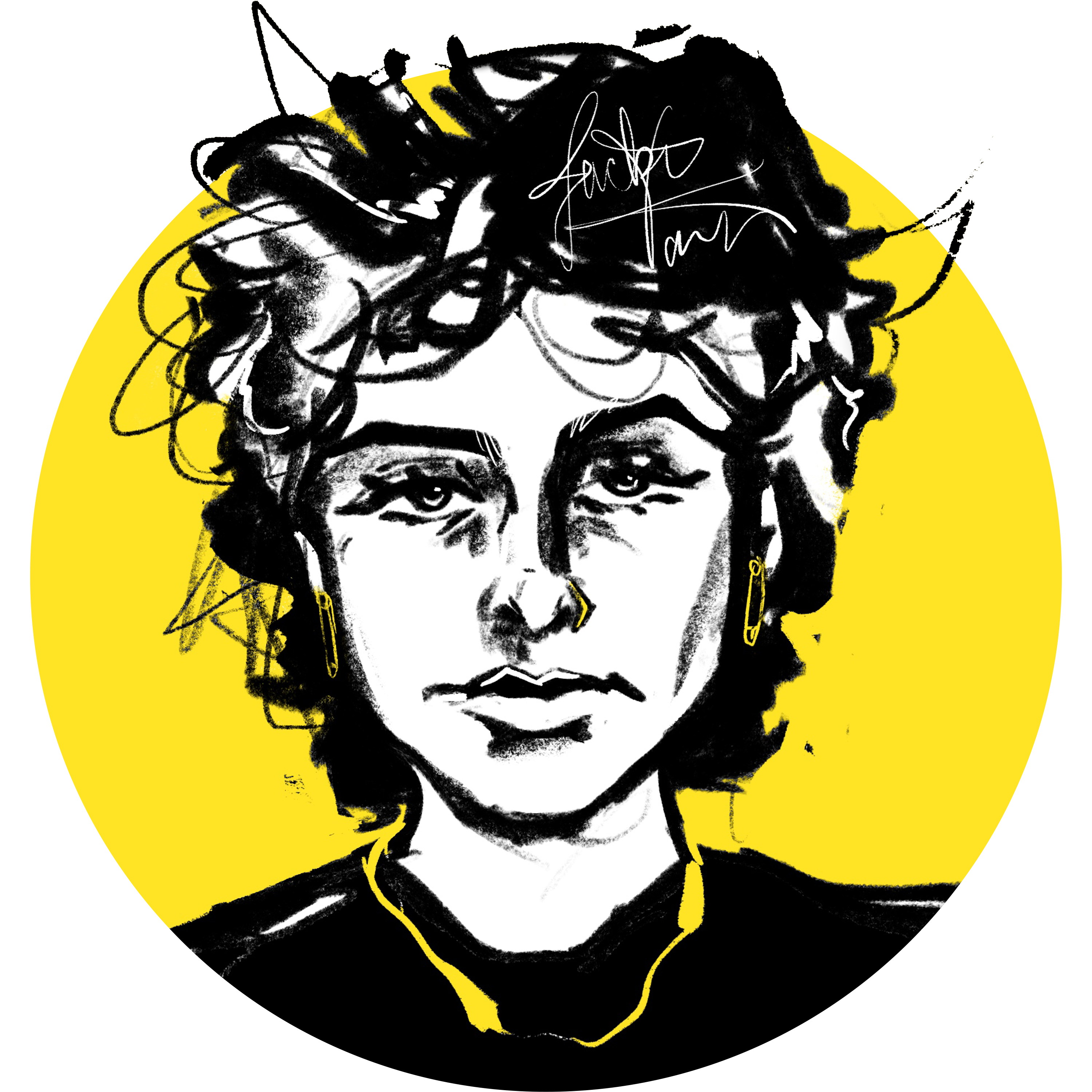
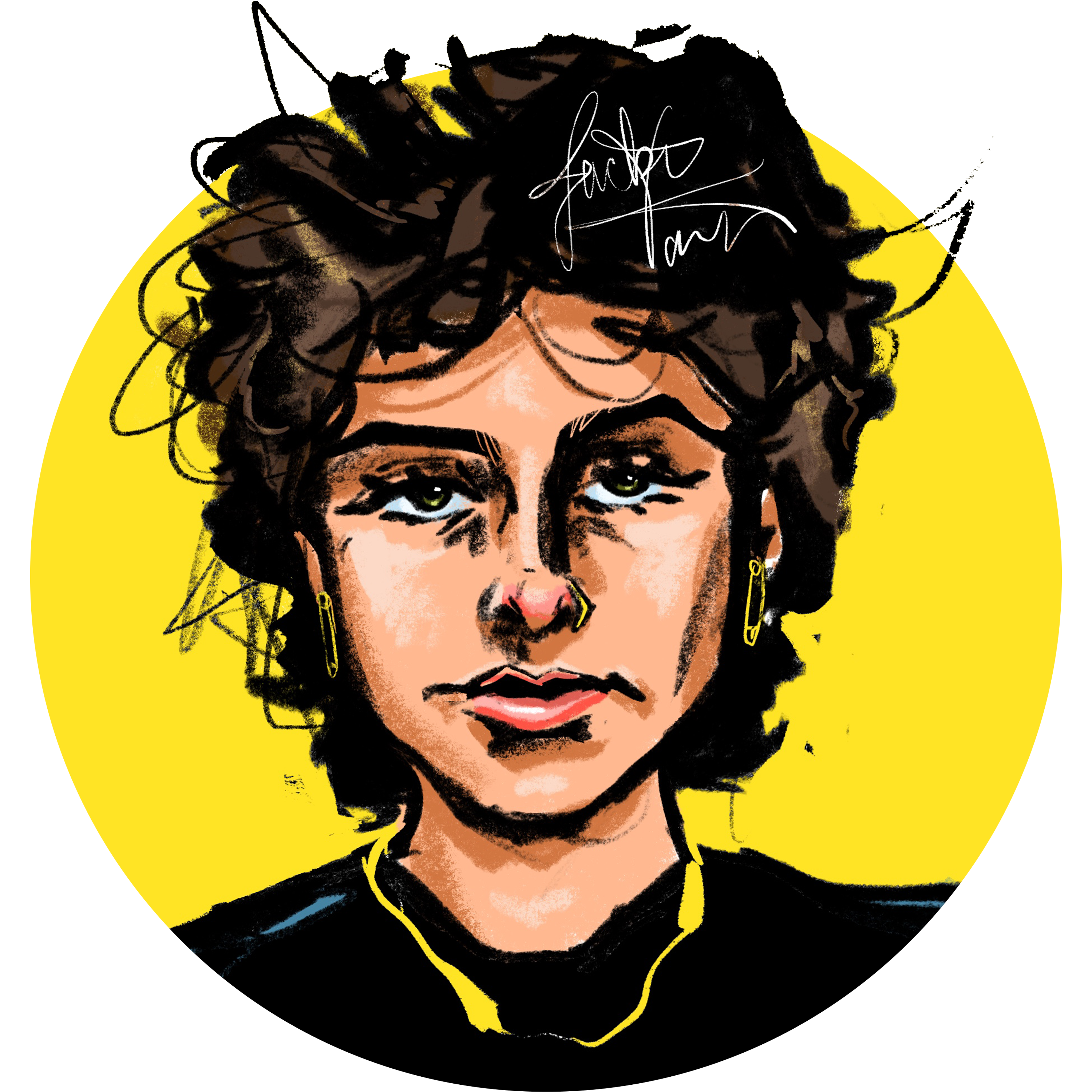
Each composition below includes a caption stating the design variable used and an explanation for the relation between the visual and Keith Haring.

Color - Keith Haring was diagnosed with AIDS in 1988 and dedicated the time he had remaining to raise awareness about the condition. This design references the AIDS Awareness "ACT UP", "SILENCE = DEATH" posters advertised during the AIDS epidemic in the 1980s. This specific design was inspired by the advertisements that featured black backdrops with white borders, bold white text, and a pink triangle—the capital 'A' in Haring's last name substitutes for the triangle.

Imagery - Keith Haring's first public "installments" were actually large (illegally drawn) chalk sketches on black, empty coverings intended to display ads in NYC's subway stations. He'd have to draw each one rather quickly, hence in this design, his gaze straying from his work to just check behind him/lookout for authorities, etc. He didn't really sign his subway drawings, but he's signing his name here because Haring's said in interviews that whenever he was caught, he'd sometimes get arrested, and sometimes they'd just want an autograph. The lines around his elbow imply movement, as many of his doodles feature similar, gestural lines.
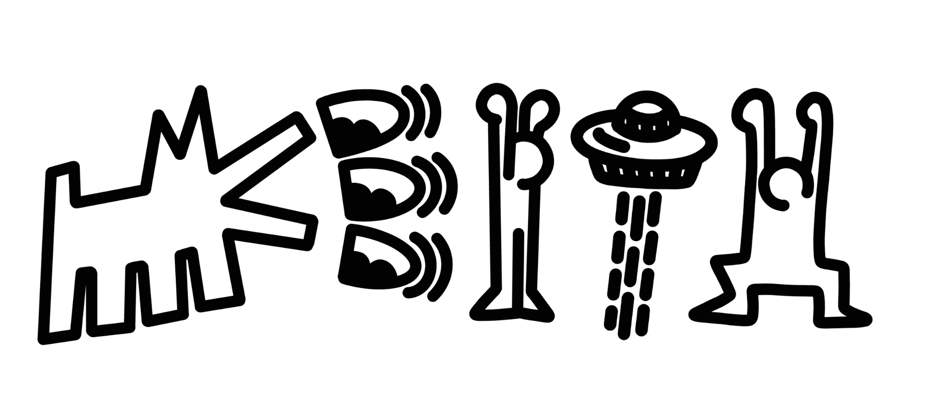
Imagery - Keith Haring's art style was very free and doodle-like, certain icons often found in multiple examples of his work grew popular in his Pop Shop, a boutique intended to make his work available to everyday people—these icons are a staple to his name. In this design, iterations of his human figures make up the 'l' and 'H' in his first name, the dog is the initial 'K', the 'E' references his "Three Eyed Monster" and the 'T' is his 'abducting spaceship' doodle.
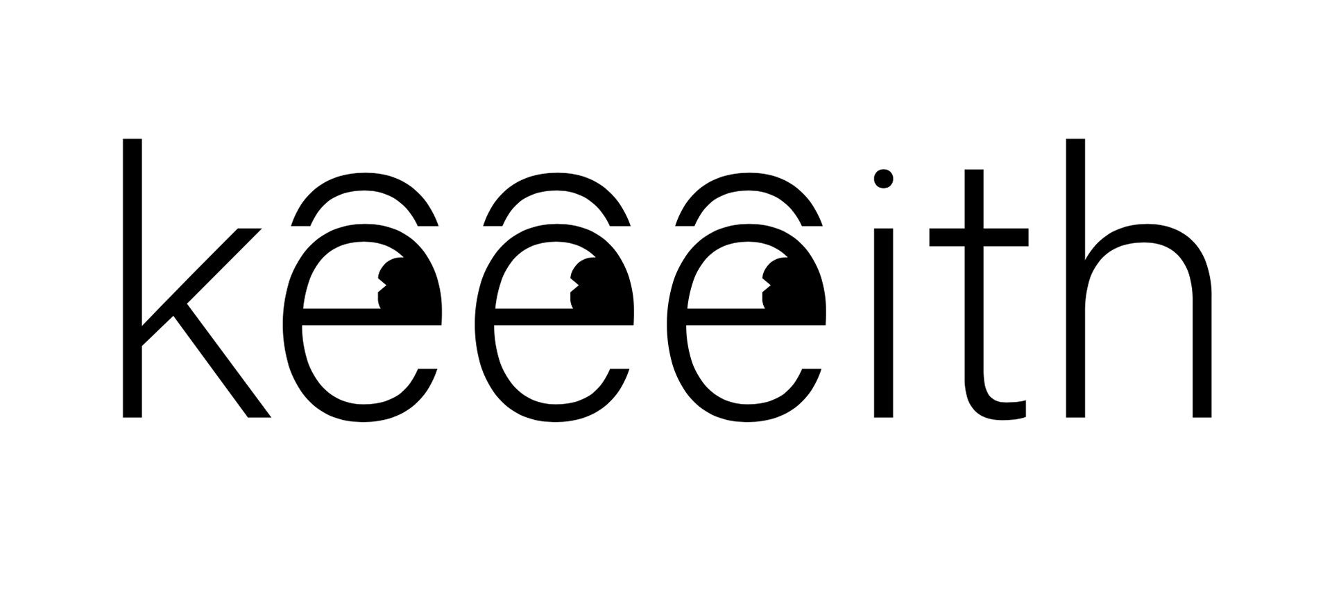
Addition - This design makes use of Keith Haring's letter 'e' in his first name. The two additional 'e's' and eye elements are included to reference his famous "Three Eyed Monster", an icon of a jolly face grinning, and relevant to this design, looking to the right.
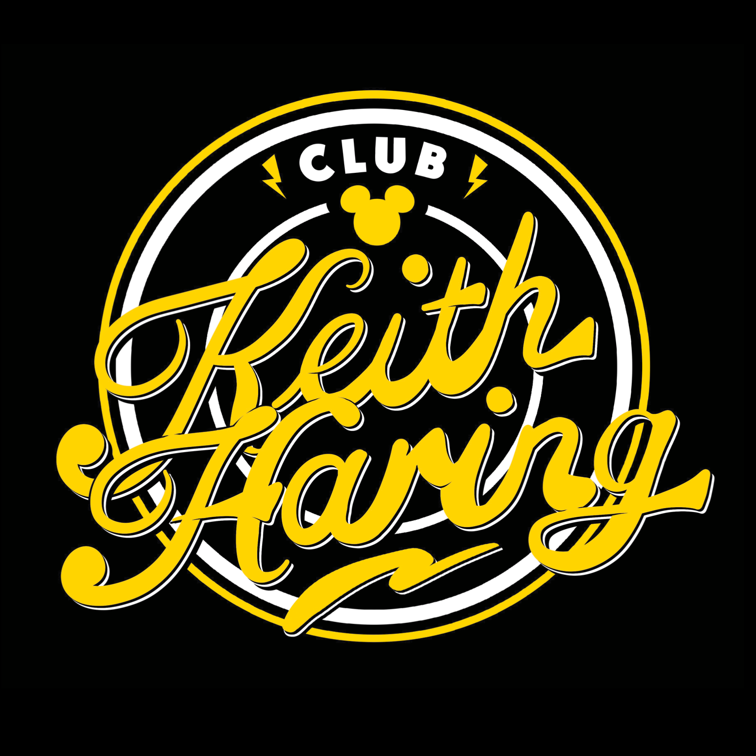
Container - As a child, Haring was infatuated with drawing. His artistic father surely influenced him, but cartoons such as Mickey Mouse gave him consistent visuals to inspire him to doodle himself. This design references one of the early "Mickey Mouse Club" emblems associated with Walt Disney. The cartoon helped shape Haring's style, which is very unique to him as an artist.
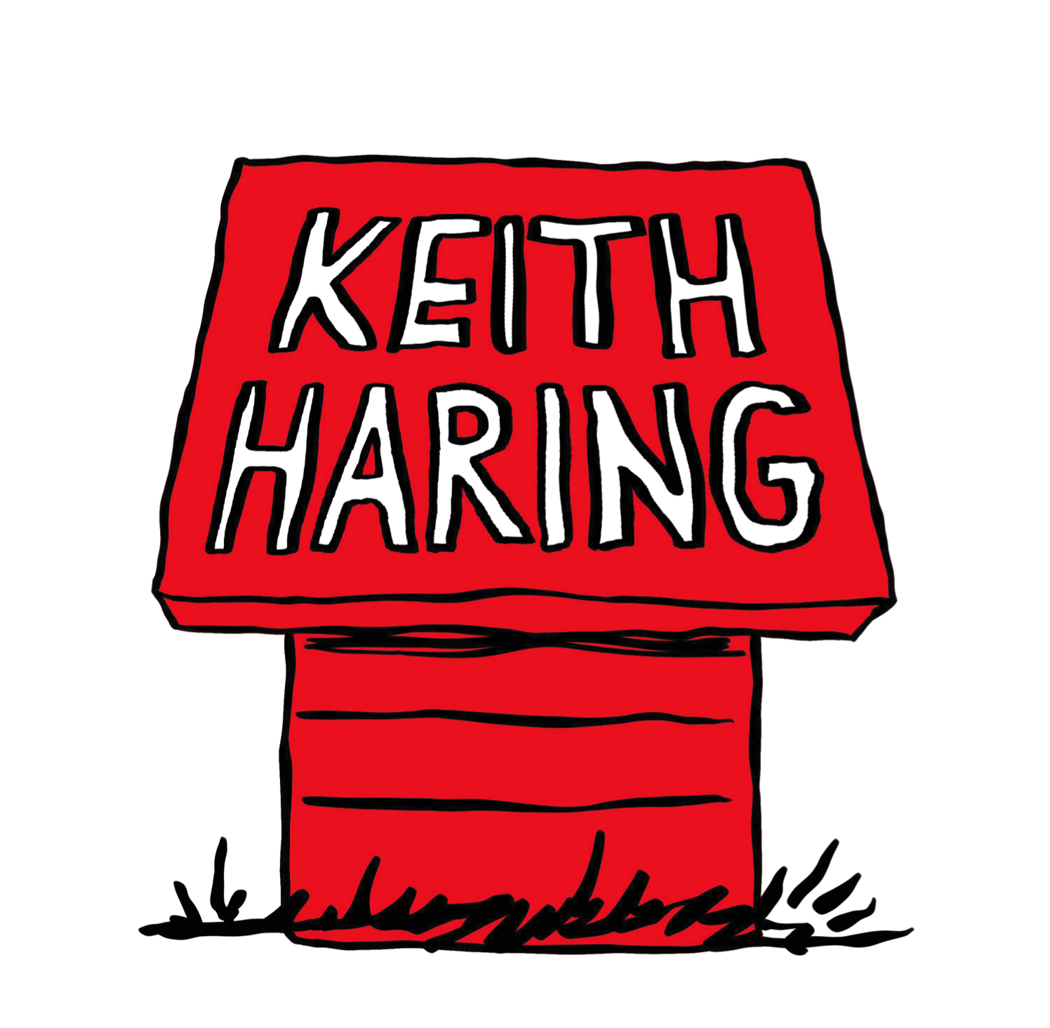
Container - The Peanuts comic created by Charles Schultz was another great source of inspiration for Haring. The strip provided him with an alternative style to Disney's and widened his perspective on drawing. This design is of Snoopy's dog house, while there's no dog lounging on top of it, the black and white, capitalized type, "KEITH HARING" alludes to that color scheme and boldness.
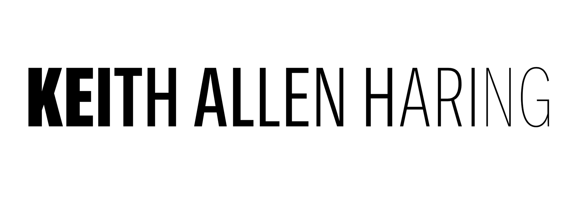
Weight - This design references Keith Allen Haring's life, specifically once in the art scene. He had solidified his name and had a bold, easily recognizable art style. However, once he was diagnosed with AIDS, his time was quickly running out. This design incorporates his full name to allude to the long, drawn-out, and painful ending that is associated with AIDS, and it begins in bold to symbolize a healthy individual, and gradually thins out, weakening the individual—a symptom of the condition.
